TAG
Motion and sound design identity for TAG Architects. Visuelt gold winner.
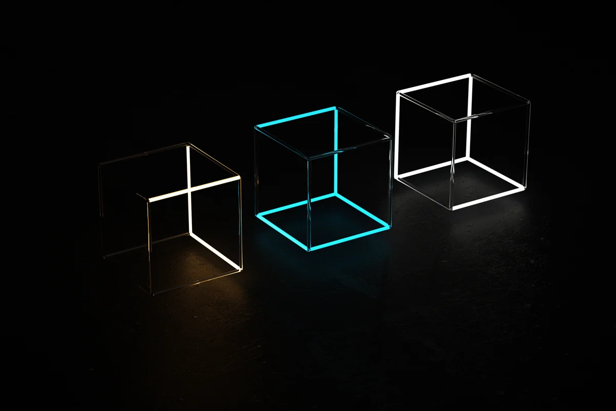
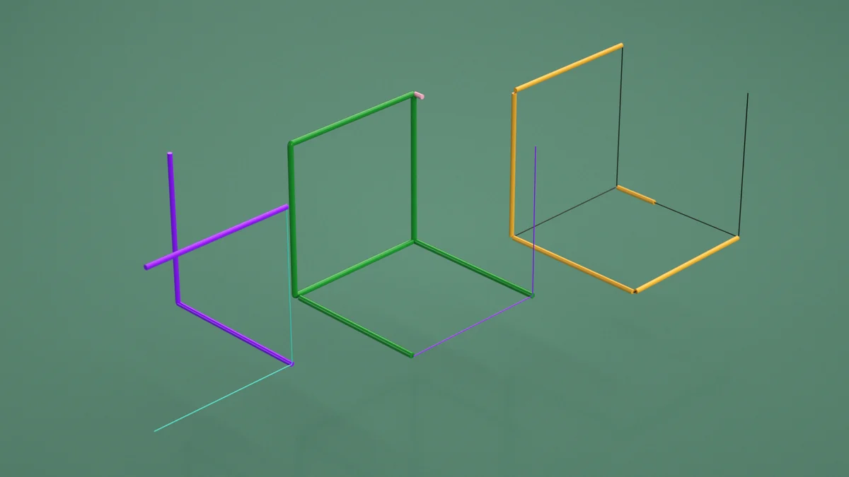
Motion and sound design identity for TAG Architects, Norway. The logo is built from minimal architectural lines, wireframe cubes and geometric planes that assemble, rotate, and intersect in space. Each configuration reveals the mark from a different angle, a different reading.
The identity plays with the fundamentals of architecture itself: structure, perspective, and the relationship between flat planes and spatial form. Simple lines carry multiple associations, from floor plans to facades to abstract sculpture.
We designed the motion system and composed the sound, giving each transition a precise, tactile quality. The identity won gold at the Norwegian design festival Visuelt. Their jury noted the ingenious simplicity, with minimalist lines revealing the logo in several clever ways while providing multiple associations with architecture.