0:00 / 0:00
Impossible Foods
Brand Systems, Sonic Work
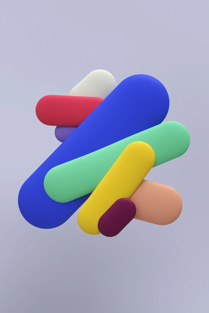
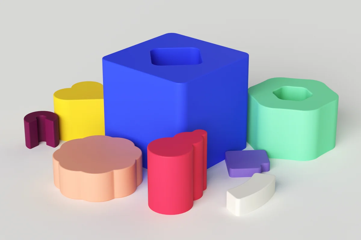
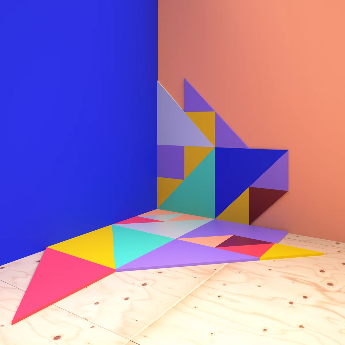
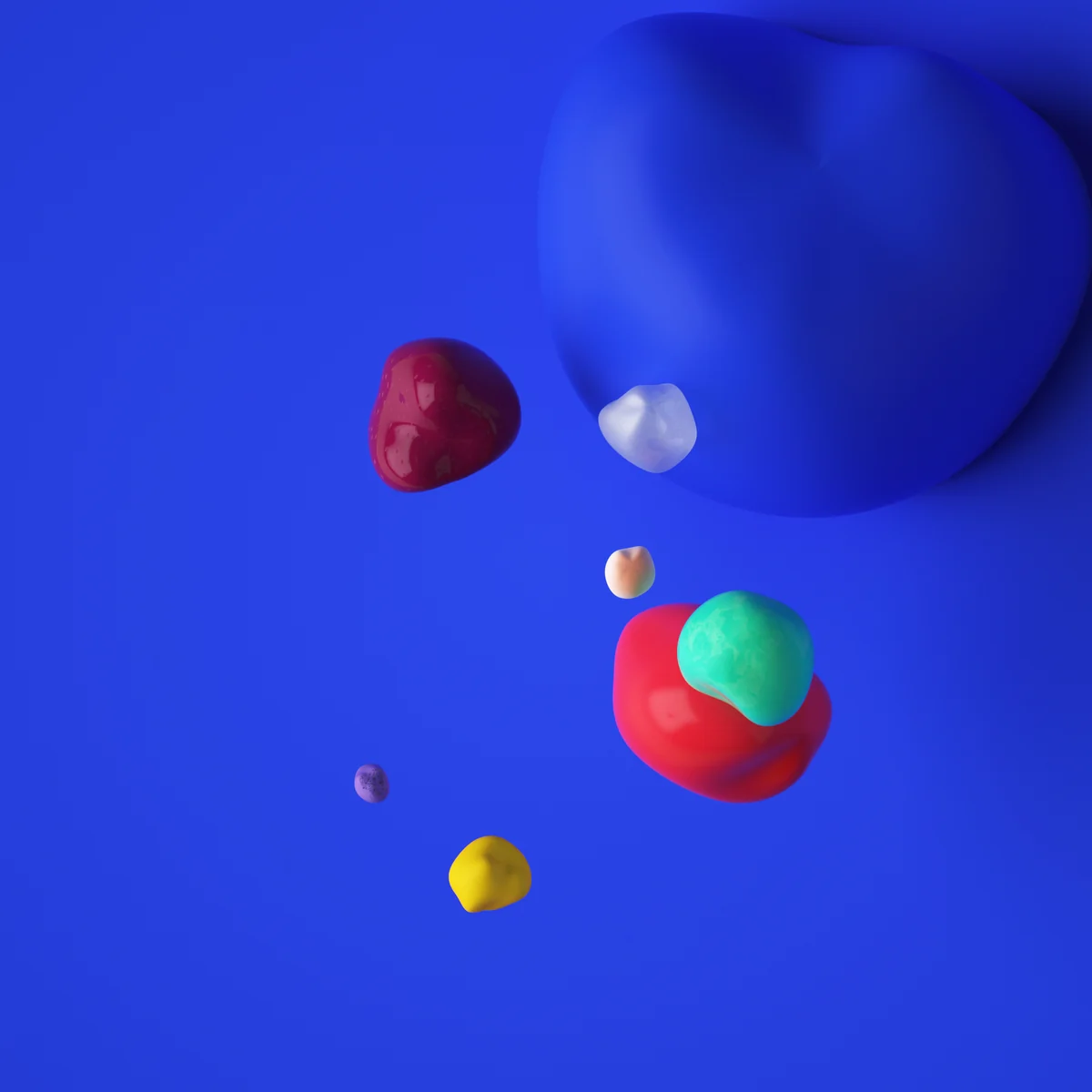
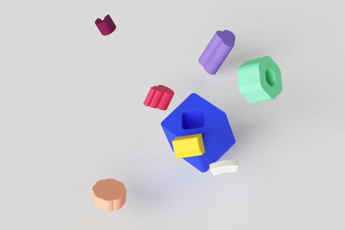
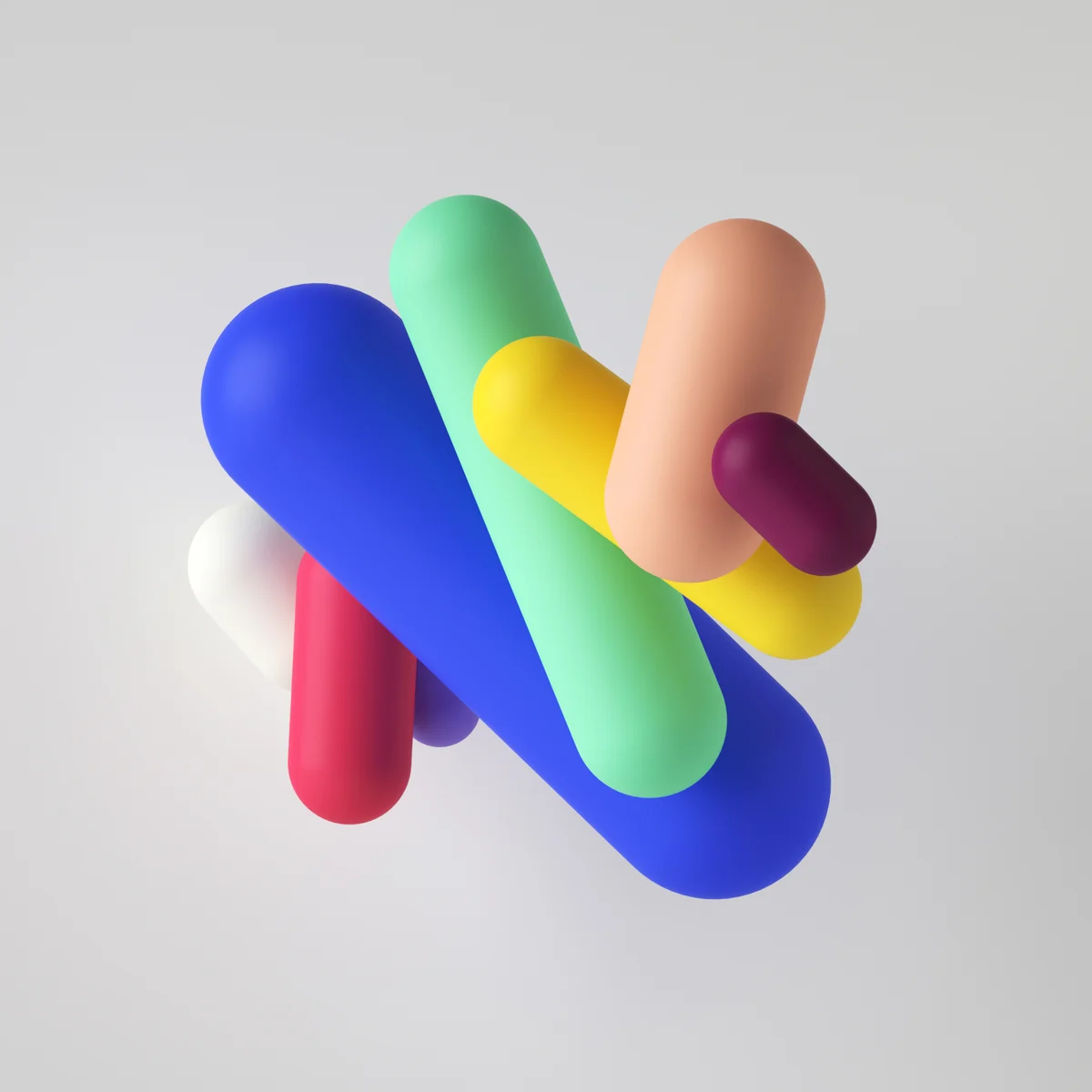
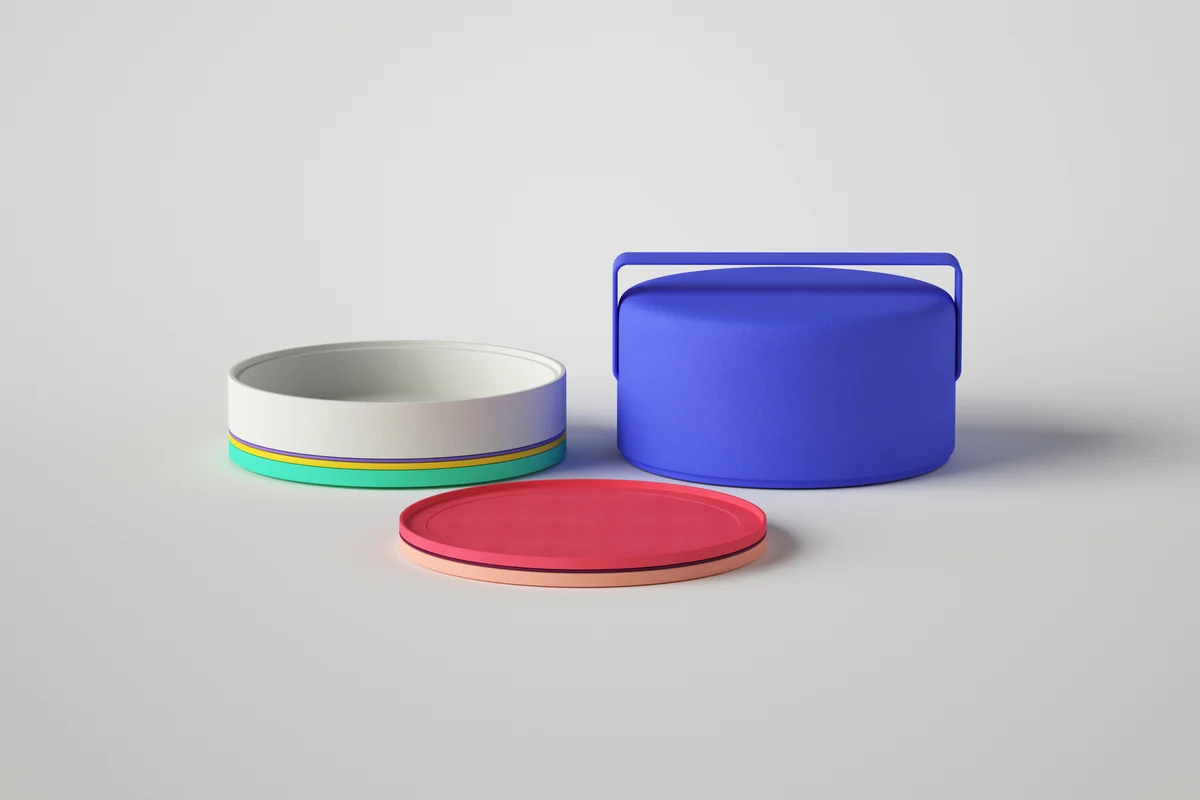
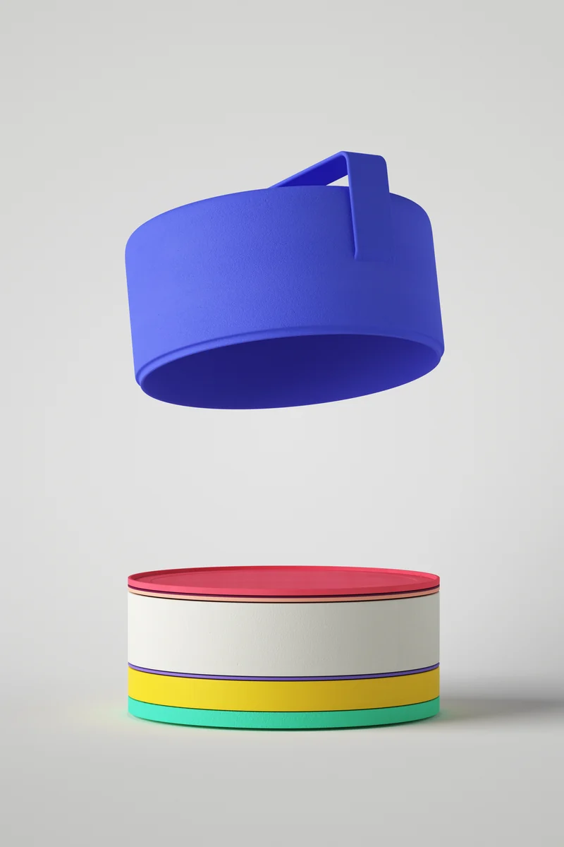
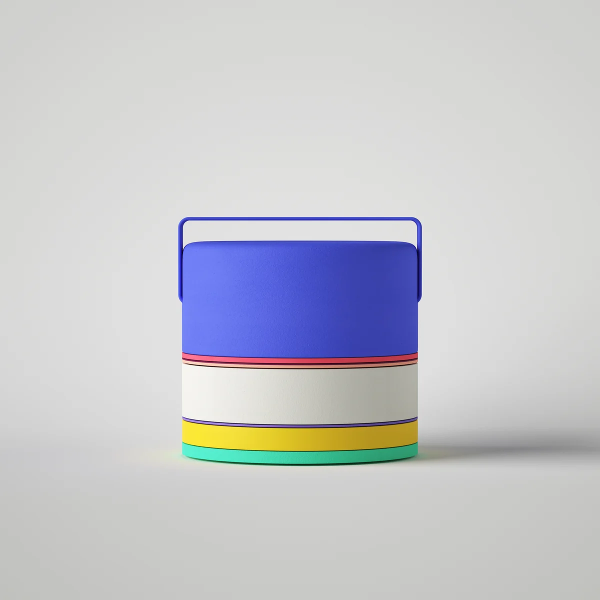
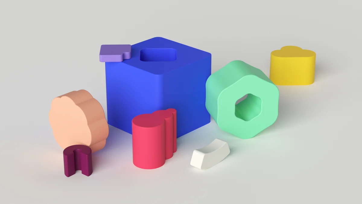
Visual and sound language for Impossible Foods. A color ratio representing 71% water vs. land.
In collaboration with West, we explored visual and sound language possibilities for the startup Impossible Foods, which aims to replace animal products with sustainable plant-based alternatives. The identity draws inspiration from their focus on creating a more balanced world by adapting a color ratio representing the 71% of water vs. land on the earth's surface. This visual ident allowed a wide variety of abstract representations to be designed around a simple premise.


Related